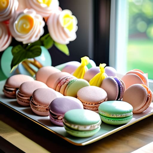
I was scrolling through a huge wedding magazine the other day and saw a spread on “luxury” aesthetics that honestly made my eyes ache. Everything was so stiff, so perfectly curated, and—let’s be real—completely unreachable for most of us. It felt like you needed a massive budget and a professional lighting crew just to pull off a simple theme. I’m so over the idea that you need to spend a fortune to make a room look intentional. If you’re looking into pastel party decor, please don’t fall into the trap of thinking it has to look like a high-end showroom. You don’t need perfection; you just need a little bit of soft color to make the space feel approachable and kind.
In this post, I’m stripping away all the fluff and sharing how I actually use color in my own studio. I’ll show you how to mix in some thrifted finds and simple textures so your pastel party decor feels lived-in and cozy rather than clinical. My goal is to give you practical, low-stress ideas that focus on creating a warm atmosphere where your guests can actually relax and talk, rather than feeling like they’re walking through a museum.
Table of Contents
Dreamy Event Styling for Meaningful Moments
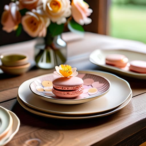
When I’m dreaming up a new look for a client, I always start by thinking about the feeling I want the room to have. For me, dreamy event styling isn’t about buying every single thing on a Pinterest board; it’s about layering textures that make people want to linger. I love playing with a macaron color palette—think creamy peaches, soft lemon, and dusty rose—because these tones feel incredibly welcoming. Instead of heavy, structured arrangements, I lean toward things that feel a bit more organic and lived-in, like mismatched vintage plates or scattered petals that look like they just fell there.
If you’re planning something a bit more specific, like baby shower pastel decorations, my biggest piece of advice is to focus on the lighting. You can have the most beautiful setup in the world, but if the overhead lights are too bright, that magic just evaporates. I always suggest using unscented tea lights or even some fairy lights tucked into a glass bowl to soften the edges. It’s those little, thoughtful touches that turn a simple gathering into a moment people actually remember.
Soft Hue Table Settings That Invite Conversation
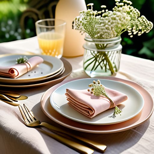
When it comes to the table, I always say that the goal isn’t to create a museum exhibit; it’s to create a space where people actually want to linger over their drinks. Instead of going overboard with heavy, formal arrangements, I love leaning into soft hue table settings that feel light and airy. Think about mixing and matching some of my favorite thrifted glassware with a subtle macaron color palette—soft pinks, creams, and buttery yellows. It’s much more inviting than a rigid, matching set, and it gives the whole meal a relaxed, effortless vibe.
If you’re feeling a bit more adventurous, playing with mint and lavender party themes can add such a lovely, whimsical touch without feeling “too much.” I usually suggest scattering a few sprigs of dried eucalyptus or some mismatched linen napkins to break up the lines. It keeps the look organic rather than manufactured. You don’t need to hunt down expensive, high-end aesthetic party supplies to make this work; honestly, a few well-placed candles and some soft textures are what really encourage everyone to lean in and actually start talking.
My Go-To Secrets for Keeping Pastels Feeling Fresh (and Not Like a Baby Shower)
- Mix in some textures so it doesn’t feel flat. Instead of just using smooth tablecloths, throw on some linen napkins or a chunky knit runner. It adds that “effortless boho” vibe I love and keeps the pastel colors from looking too sugary.
- Don’t be afraid to lean into the vintage side of things. I’m always hunting for mismatched glassware at thrift stores, and honestly, a few dusty rose or mint green vintage coupes add so much more character than a matching set from a big-box store.
- Use greenery to ground the soft colors. If you’re using a lot of pale lavender or peach, tucking in some eucalyptus or even just some simple dried wildflowers helps the palette feel more organic and a little less “perfectly staged.”
- Lighting is your best friend when working with light colors. Avoid those harsh overhead lights at all costs! Stick to warm fairy lights or a few unscented tapered candles; it makes the pastel tones glow rather than looking washed out.
- Keep the “pop” subtle. If you want to add a bit of contrast, don’t go for neon. Just grab something like a muted sage or a deeper terracotta to anchor the lighter shades so your eyes have a place to rest while you’re chatting.
Quick Tips for a Stress-Free Pastel Party
Keep things low-pressure by mixing your pastel colors with textures you already own, like linen napkins or vintage glass, so it feels cozy rather than staged.
Focus on lighting to bring those soft hues to life; dimming the overheads and using a few warm lamps will make even the lightest colors feel intimate and inviting.
Don’t get caught up in perfection—if a centerpiece isn’t exactly how you pictured it, just lean into the relaxed, bohemian vibe and focus on making sure your guests have a drink in hand.
Keeping it Light and Lovely
“I always tell my clients: don’t let the decor become the main event. Use those soft, dreamy pastels to set a gentle stage, but make sure the real magic is happening in the laughter and the stories shared around the table.”
Saoirse Mullan
Bringing the Magic Home
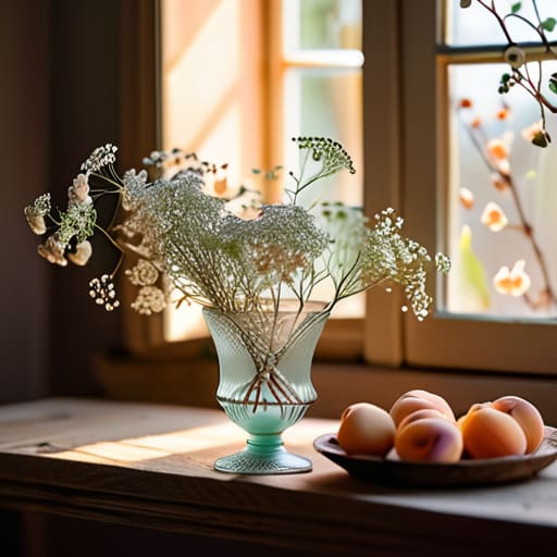
At the end of the day, decorating with pastels isn’t about following some strict design rulebook or matching every single napkin perfectly. It’s really just about using those soft, calming tones to create a backdrop where your guests feel relaxed from the moment they walk through the door. Whether you’re layering mismatched vintage glassware on a thrifted tray or just scattering some pale peach blooms across the table, the goal is to build an atmosphere that feels intentional but effortless. Remember, you don’t need a massive budget to pull this off; you just need a few thoughtful touches that make the space feel warm and inviting.
Please, don’t let the stress of “perfect” styling get in the way of actually enjoying your own party. I’ve been in those situations where the host is so worried about a crooked centerpiece that they spend the whole night in the kitchen instead of sitting down with their friends. Your people are coming to see you, not to audit your color palette. So, grab a drink, dim the lights, and let those soft hues do the heavy lifting. If you focus on the connection and the conversation, the decor will naturally fall into place. You’ve got this, and I promise, your guests are going to love it.
Frequently Asked Questions
How do I mix different pastel shades without the whole setup looking a bit washed out or messy?
I totally get it—it’s so easy for pastels to turn into a blurry, washed-out mess if you aren’t careful. My secret? Pick one “anchor” color to be the star, then layer in the others. If you’re leaning into a soft sage, use a tiny bit of dusty rose or pale lemon to add contrast. Also, don’t be afraid of texture! A chunky linen tablecloth or some vintage glassware helps define those soft colors so they actually pop.
Can I use pastel decor for a more "grown-up" dinner party, or does it always end up feeling a bit like a baby shower?
Oh, I get this question all the time! And honestly? Absolutely. You can totally pull off pastels for a sophisticated dinner without it feeling like a nursery. The trick is all in the textures and the “weight” of your pieces. Instead of matte plastics, think heavy linen napkins in sage or dusty rose, or even some of those vintage amber glasses I love hunting for. Pair them with darker wood or metallic accents, and it feels intentional and chic, not sugary.
What kind of lighting works best to make those soft colors actually pop instead of looking dull in a dim room?
Honestly, this is where most people trip up! If the room is too dark, those lovely pastels just turn into a muddy grey. To keep them looking fresh, skip the harsh overhead lights and go for warm-toned lamps or plenty of fairy lights. If you can, layer in some unscented tea lights too. That soft, golden glow makes the colors feel intentional and cozy rather than just washed out in the shadows.
