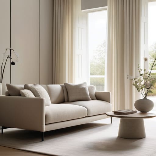
I used to think that if I wanted a “designer look” for a dinner party, I had to spend a small fortune on coordinated linens, custom floral arrangements, and those ridiculously expensive sculptural centerpieces that look beautiful in photos but leave you with zero room to actually set down a drink. Honestly, the idea that you need a massive budget to pull off a cohesive vibe is such a myth. I’ve learned through years of styling events that leaning into monochrome decor isn’t about being boring or clinical; it’s actually the ultimate cheat code for making a space feel intentional without the stress of matching a dozen different colors.
In this post, I’m stripping away the fluff and sharing how you can use a single color palette to create a mood that feels warm and welcoming rather than stiff. I won’t be giving you a list of luxury items to buy, but rather some practical, real-world ways to layer textures and light so your setup looks effortless. We’re going to focus on how to make your home feel like a curated sanctuary where the decor sets the stage, but the actual conversation remains the star of the show.
Table of Contents
- Embracing Minimalist Interior Design Principles for Better Conversation
- Using Neutral Color Schemes for Living Rooms to Ease the Mind
- My Little Secrets for Pulling Off a Monochrome Look Without It Feeling Cold
- My Top Three Tips for Keeping it Simple
- ## The Magic of Less
- Making It Your Own
- Frequently Asked Questions
Embracing Minimalist Interior Design Principles for Better Conversation
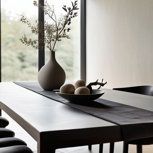
When we’re hosting, it’s so easy to let the “stuff” take over. I’ve seen so many beautiful parties where the table is so cluttered with tiny trinkets and elaborate floral arrangements that guests feel like they shouldn’t even touch anything. By leaning into minimalist interior design principles, you’re essentially clearing the stage for your guests to shine. When the visual noise is dialed down, people naturally gravitate toward each other rather than getting distracted by a dozen different focal points.
The trick to making a single-color space feel cozy rather than cold is all about texture layering in monochromatic rooms. If you’re working with a cream or beige palette, don’t just throw out a plain white tablecloth. Instead, mix in a chunky knit throw, some linen napkins, and maybe even some smooth ceramic bowls. This creates a sense of richness and warmth that invites people to lean in and stay a while. It’s about creating a soft, tactile environment where the atmosphere feels intentional, but the focus stays exactly where it belongs: on the actual conversation happening around the table.
Using Neutral Color Schemes for Living Rooms to Ease the Mind
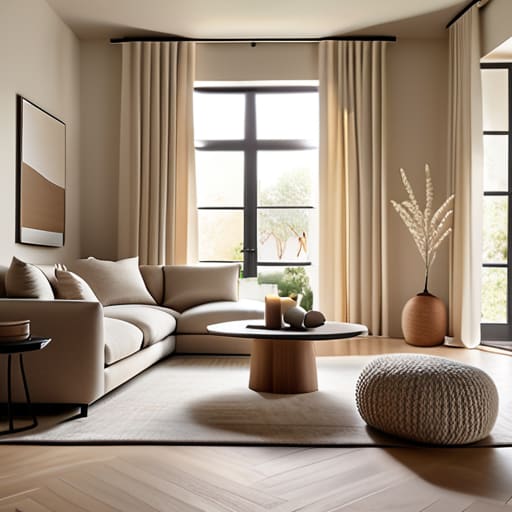
When I’m styling a space for a client, I always tell them that the goal isn’t to make a room look like a museum, but to make it feel like a hug. Using neutral color schemes for living rooms is one of the easiest ways to do that. When you strip away the loud, clashing patterns and bright neon pops, the visual noise just… stops. It’s like the room finally takes a deep breath. For me, a palette of soft creams, warm sands, or even a very light greige creates this calm, steady backdrop that lets your guests actually relax into their seats rather than feeling overstimulated by the decor.
The trick to making sure a neutral room doesn’t feel “flat” or boring is all about texture layering in monochromatic rooms. Since you aren’t using color to create interest, you have to use touch. Think about pairing a chunky knit throw over a smooth linen sofa, or placing some rough, handmade ceramic bowls on a sleek wooden coffee table. It’s those little variations in shades and tints that add soul to the space, making it feel intentional and cozy rather than just empty.
My Little Secrets for Pulling Off a Monochrome Look Without It Feeling Cold
- Play with textures so things don’t look flat. If you’re doing an all-cream setup, mix a chunky knit throw with some smooth linen napkins and maybe a velvet cushion. It keeps the eye moving and makes the room feel cozy rather than sterile.
- Don’t be afraid of “near-miss” shades. You don’t need ten different cans of the exact same beige; in fact, it’s better if they aren’t identical. Mixing slightly different tones of the same color adds a lovely depth that feels much more natural and lived-in.
- Use your lighting to create the mood. Since you aren’t relying on bright colors to pop, use warm lamps or a few scattered candles to create shadows and highlights. It adds that “magical” layer to a monochrome space that makes people want to linger.
- Let your thrifted finds do the heavy lifting. I love pulling in a vintage glass vase or an old ceramic pitcher that fits your color palette. It adds a bit of soul and history to the room so it doesn’t look like you just bought everything in one go from a big-box store.
- Keep your “pops” organic. If you’re doing a moody, dark monochrome look, use greenery or even just a bowl of fruit to break things up slightly. It provides a tiny bit of life without breaking the cohesive, intentional vibe you’ve worked so hard to create.
My Top Three Tips for Keeping it Simple
Don’t get caught up in the “perfect” color palette; pick one or two soothing tones and let the textures—like a chunky knit throw or some linen napkins—do the heavy lifting so the room feels cozy rather than cold.
Use your decor as a backdrop, not the main event; when the visual noise is turned down, your guests naturally gravitate toward each other and the conversation flows much more easily.
Focus your budget on the things people actually touch and taste, like good glassware or comfortable seating, rather than spending a fortune on tiny decorative bits that just end up collecting dust.
## The Magic of Less
“I’ve learned that when you stop trying to compete with a million different colors and patterns, you actually create space for the people in the room to breathe. A monochrome palette isn’t about being boring; it’s about turning down the visual volume so the laughter and the conversation can finally take center stage.”
Saoirse Mullan
Making It Your Own
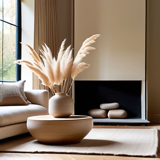
At the end of the day, leaning into a monochrome palette isn’t about following some strict design rule or making your home look like a sterile showroom. It’s really just a clever way to strip away the visual clutter so that your guests can actually focus on each other. By using those calming neutrals to set the stage and keeping your decor intentional rather than overwhelming, you’re creating a space where the atmosphere does the heavy lifting for you. Whether you’re playing with different textures to keep things cozy or sticking to a single, sophisticated shade, the goal is to build a backdrop that feels effortless and inviting rather than staged.
So, please don’t feel like you need to go out and buy a whole new set of furniture just to get this look right. Start with what you have, maybe add a few thrifted pieces in a similar tone, and focus on that warm, soft lighting we talked about. Hosting should be about the laughter shared over a good meal, not whether your color coordination is technically perfect. Remember, your home is a living, breathing space, not a museum. Just clear a little bit of the noise, dim the lights, and let the real magic happen through the people sitting around your table.
Frequently Asked Questions
Won't a single-color setup feel a bit cold or uninviting for my guests?
I totally get that worry—I used to think “monochrome” meant “hospital waiting room,” too! But the trick is to play with textures rather than colors. Instead of adding more hues, think about layering a chunky knit throw over a linen sofa, or using ribbed glassware next to smooth ceramic plates. It’s all about that tactile warmth. When you mix materials, the room feels incredibly cozy and intentional, never cold or clinical.
How do I mix different textures so the room doesn't just look flat and boring?
This is such a common worry! When you’re sticking to one color, things can definitely start feeling a bit “flat” if you aren’t careful. My secret is to play with tactile variety. Think about pairing a chunky knit throw over a smooth velvet sofa, or placing some rough, organic linen napkins on a sleek wooden table. It’s all about that contrast—mixing smooth, fuzzy, and grainy elements keeps the eye moving without needing extra colors.
Is it okay to mix in a few vintage or colorful pieces, or will that ruin the whole vibe?
Oh, absolutely! In fact, that’s exactly how you stop a monochrome room from feeling like a sterile hotel lobby. If everything is perfectly matched, it can start to feel a bit stiff. I love throwing in a few mismatched vintage glass coupes or a single, colorful ceramic bowl I found at a thrift shop. Those little pops of personality act like conversation starters and make the space feel lived-in and cozy rather than just “designed.”
