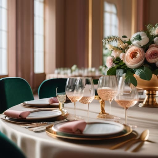
I remember one of my first big catering gigs back in my twenties, standing in a massive, cold ballroom surrounded by these incredibly expensive, perfectly coordinated floral arrangements. Everything was so “on-brand” and meticulously matched that it actually felt uninviting, like if I accidentally moved a single chair, the whole aesthetic would crumble. People were barely talking because they were too busy admiring the decor, and honestly? It felt stiff and fake. We get so caught up in the pressure of picking the “correct” color schemes that we forget we’re actually hosting human beings, not setting up a museum exhibit.
I’m not here to give you a lecture on color theory or tell you that you need to spend a fortune on custom linens to impress anyone. Instead, I want to share what I’ve learned from years of styling real homes for real people. I’ll show you how to pick palettes that feel warm and effortless, focusing on how colors actually affect the mood of the room. We’re going to find a way to make your space look intentional without making it feel like a showroom, so your guests can focus on the actual conversation.
Table of Contents
Using the Psychology of Color in Design to Foster Connection
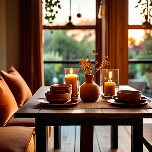
Now, I’m not saying you need to go back to school for a degree in art, but understanding a little bit about the psychology of color in design can totally change how your guests feel when they walk through the door. I’ve learned through years of styling that colors aren’t just pretty—they actually dictate the “vibe” of the room. For instance, if you’re hosting a cozy, intimate dinner where you want everyone to really open up, you might want to lean into warmer tones. Soft terracottas or muted ambers can make a space feel incredibly inviting and safe, which is exactly what you want when you’re aiming for deep conversation rather than loud, chaotic energy.
On the flip side, if you’re planning a bright, midday brunch, you might play around with analogous color schemes—think soft peaches blending into warm yellows. This creates a sense of harmony that feels effortless rather than forced. The goal isn’t to create a museum-perfect display; it’s about using these subtle shifts to make sure nobody feels like they’re sitting in a cold, sterile room. Just keep it relaxed and cohesive, and your guests will naturally settle in.
Finding Balance Through Complementary Color Combinations
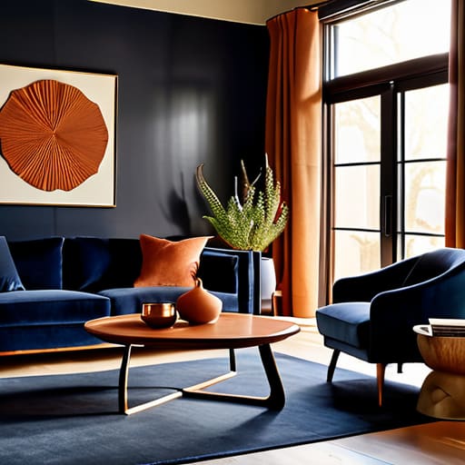
Now, I know that diving into all those different hues can feel a bit overwhelming, especially when you’re staring at a blank living room. If you want to create a space that feels lively but not chaotic, I always suggest playing around with complementary color combinations. This is basically just picking colors that sit opposite each other on the color wheel—think a deep navy paired with a warm, burnt orange. It creates this wonderful visual energy that makes a room feel “finished” without looking like a sterile showroom.
That being said, if you’re someone who gets a little anxious about things feeling too loud, don’t feel like you have to go big. You can always lean into analogous color schemes, which are just colors that sit right next to each other, like soft sage, forest green, and a hint of mustard. It’s much more low-key and soothing. My personal rule of thumb? If you’re stuck, just grab a few thrifted pieces in different shades of the same tone to create monochromatic color palettes. It’s an easy way to look intentional while keeping the vibe totally relaxed.
My Go-To Rules for Picking Colors Without the Stress
- Don’t feel like you need to match everything perfectly. In fact, a little bit of “mismatch” makes a space feel lived-in and relaxed rather than like a showroom floor. If you’re using vintage glassware, let those slightly different shades of amber or green be part of your palette.
- Use the 60-30-10 rule to keep things from feeling chaotic. Aim for about 60% of a dominant neutral, 30% of a secondary color, and then save that final 10% for your “pop”—maybe some bright velvet pillows or colorful napkins—to keep things interesting.
- Test your colors in the actual light of your room. I’ve learned the hard way that a beautiful sage green can look totally different under warm evening lamps than it does in the bright afternoon sun. Always check the vibe once the sun goes down.
- Lean into nature when you’re stuck. If you can’t decide on a scheme, just look outside. The combination of earthy terracotta, soft mossy greens, and sky blues is foolproof and always feels incredibly welcoming to guests.
- Keep your “base” colors calm so the conversation can stay loud. If your walls or large rugs are too bright or jarring, people can get a bit restless. Stick to softer tones for the big stuff, and save the high-energy colors for the tabletop decor.
My Quick Cheat Sheet for Picking Your Palette
Don’t get paralyzed by a perfect color wheel; just pick a few tones that feel cozy and make you actually want to hang out in the room.
Use color to guide the vibe—think warm, soft hues for long dinner chats and brighter pops if you’re planning something a bit more high-energy.
Remember that your thrifted glassware and existing decor matter more than a matching set, so choose colors that play nice with what you already own.
My Golden Rule for Color
Honestly, don’t get paralyzed trying to pick the “perfect” palette from a designer magazine; just lean into colors that feel like a warm hug, because if your guests feel cozy, they’ll actually stay and talk.
Saoirse Mullan
Bringing It All Together
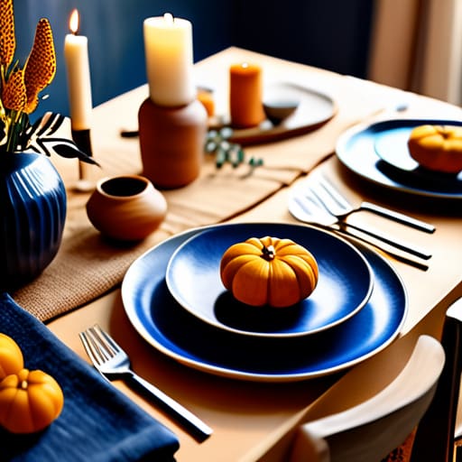
At the end of the day, whether you’re leaning into those deep, moody blues to spark a late-night conversation or playing with bright, sunny yellows to keep the energy high, remember that color is just a tool to help your guests feel a certain way. We’ve talked about using psychology to build connection and how to balance out those bold choices with complementary tones, but please don’t let the “rules” paralyze you. You don’t need a perfectly curated, museum-grade palette to host a successful evening. Just aim for a sense of cohesion and comfort that reflects the vibe you want to create, and you’ll be more than halfway there.
If you find yourself stressing over whether the napkins perfectly match the tablecloth, just take a breath and remember why you’re doing this in the first place. You’re creating a space for the people you love to laugh, eat, and actually connect with one another. If the colors are a little off or the palette isn’t technically “perfect,” your friends won’t notice—they’ll be too busy enjoying the atmosphere you’ve built. So, grab those warm tones, dim the lights, and trust your gut. You’ve got this, and I can’t wait to hear how your next gathering turns out!
Frequently Asked Questions
I have a really dark living room with heavy furniture; how do I pick colors that won't make the space feel even smaller or gloomier?
Oh, I’ve been there! I once tried to host a dinner in my tiny, cave-like studio apartment and felt like I was hosting in a dungeon. My secret? Don’t fight the darkness; lean into it with “glowy” colors. Instead of stark white, which can look gray and depressing against heavy furniture, try warm creams, soft terracottas, or even a dusty sage. Pair them with plenty of layered lighting—think lamps and fairy lights—to make the room feel intentional and cozy rather than cramped.
Is it okay to mix and match different color schemes if I'm using thrifted decor, or will it end up looking messy?
Oh, absolutely! In fact, that’s my favorite way to do it. If you’re using thrifted pieces, trying to make everything match perfectly is a losing battle anyway. Instead of aiming for “identical,” aim for “cohesive.” Pick one common thread—maybe it’s a specific warm undertone or a certain metal finish—to tie those mismatched treasures together. It shouldn’t look messy; it should look curated, like it has a story to tell.
How much of the color scheme should come from the actual decor versus things like lighting and candles?
Honestly, don’t get too hung up on the physical stuff. I always say the decor is just the foundation, but lighting is the soul of the party. I like to keep the actual decor—like linens or flowers—fairly neutral so they don’t compete. Then, I let the candles and warm lamps do the heavy lifting. That golden, flickering glow can make even a basic white tablecloth feel intentional and incredibly cozy.
